Insight Analysis
Using Data Analytics requires coding in order to collect data on events. Please refer to the SDK documentation required for your website/app on the left menu for each language.
Learn (with examples) how to perform your desired data analysis using Hackle's Data Analytics > Data Insights platform.
Data Insights analysis is available within the Data Insight tab in the Data Analysis menu.

Example of data analytics based on user inflow/visit
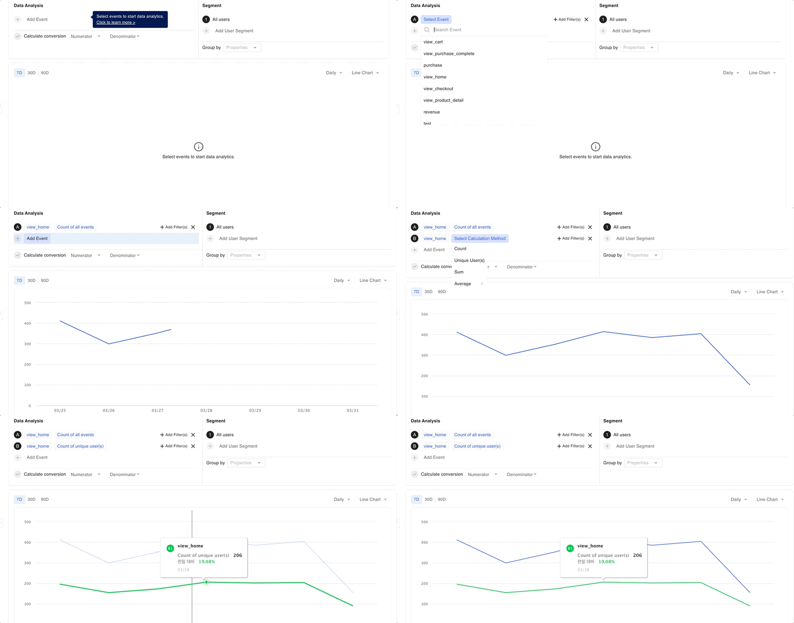
Select an event regarding the specific page visit you want in the analytics section.
After selecting the event, if you select 'Count', you can check the total number of page visits (Page View), and if you select 'Unique User(s)', you can check the total number of unique visitors. Once you select the desired event, the chart is immediately displayed at the bottom, and you can also see the raw data in the table. You are able to set the search period and period unit to your desired time/time frame.
Checking the total number of visits and the number of visitors simultaneously
You can also check both items at the same time by selecting the first item as 'Count' as the first item of the analysis event, and selecting 'Unique User(s)' as the second item by clicking the 'Add Event' button underneath the Data Analysis menu within Data Analytics.

Narrowing the data down to compare between users who directly accessed the page (direct traffic source) and users who entered via Google search (Google search traffic source)?
Select the first item in the user segment group as Referer > Direct and click 'Add User Segment' and set the second item to Referer > Google to collect and compare only the data of users corresponding to the specific conditions. If you change the chart format to a bar chart at this time, you can easily view the data based on each analysis event and user group.
Viewing and analyzing the full details of each traffic source in one glance?
Try using the 'Group by' feature! If you select the Referer for 'property', you can check all detailed data based on that specific property. By changing the chart format to a stacked line chart or a vertical bar chart, you can easily compare the data by each property.
Example of data analytics based on order/sales KPI
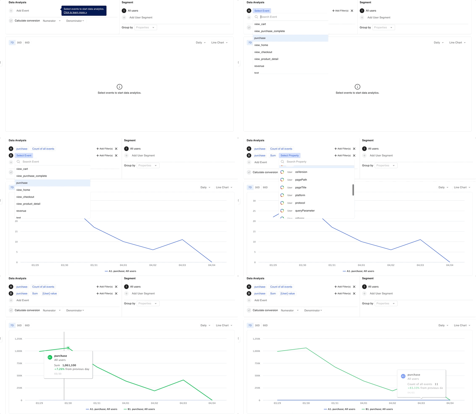
Select the purchase event within the data analysis section.
After selecting an event, you can check the number of orders if you select 'Count', the number of purchasers if you select 'Unique User(s)', and total revenue if you select 'Sum'. In the case of 'Sum', you need to select the basis or the specific properties for summing the values. For example, in order to calculate the total order amount of sales, you can select the properties, value, or order_amount, that corresponds to the order amount.
You also need to select the criteria or properties to base your 'Average' calculations. 'Average Value' can be used for calculating average purchase price (AOV), 'Average Count per User' can be selected to find the number of purchases per user, and 'Average Value per User' can be selected to calculate the average revenue per user.
Checking the total revenue and the number of orders simultaneously
You can check both items at the same time by selecting the first item of the analysis event as 'Unique User(s)' and selecting 'Sum' as the second item of the analysis event by clicking the 'Add Event' button underneath the Data Analysis menu within Data Analytics.

Comparing subjects located in a specific area
Select the first item in the segment group as Location > New York, click 'Add User Segment', and set the second item to Location > Dallas to collect and compare the data of users who meet the conditions of the location property. If you change the chart format to a bar chart at this time, you can easily view the data based on each analysis event and user group.
Viewing top products/categories based on total revenues at a glance?
Try using the Group by feature! If you select a product or category in 'Properties', you can check all detailed item data based on that property. If you change the chart format to 'Pie Chart', you will be able to view the top data during the total period in one glance.
Example of data analytics involving conversion rates
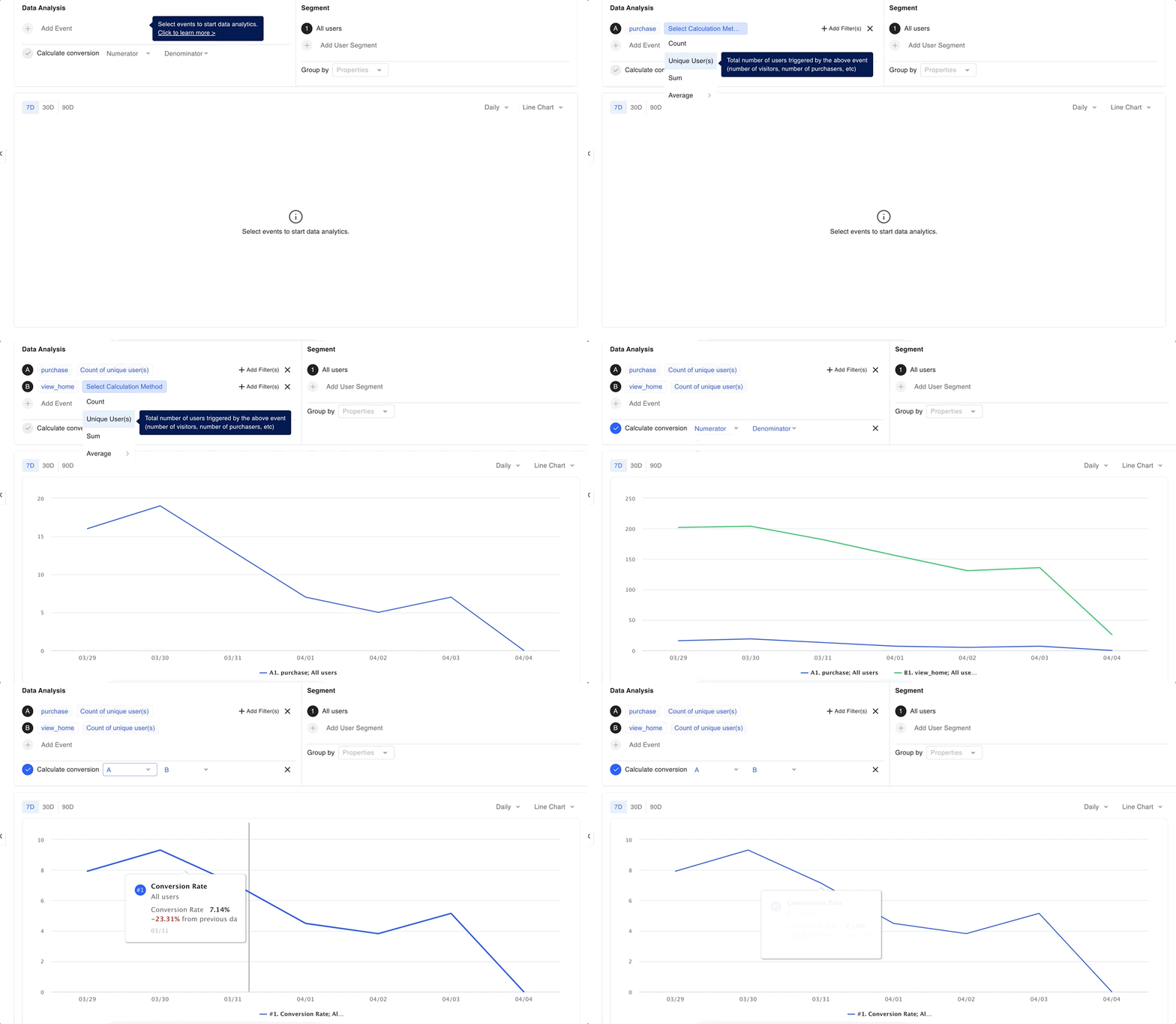
Select two desired events from the data analysis section. Say that you want to analyze the conversion rate for the action 'homepage visit' followed by the action 'purchase' or in other words the number of unique users who purchased after visiting the homepage. If you want to calculate the conversion rate calculation based on PV, select 'Count', if the basis of calculation is UV, select 'Unique User(s)'.
Then select the event that fits the numerator and denominator for the conversion calculation.

How about other types of conversion rates?
You can easily create and monitor various different types of conversion rates by selecting multiple desired events in the data analysis section, and customizing the denominator and numerator!
If you want to compare the target by limiting it to iOS and Android?
Select the first item in the user group as osName > iPhone and click 'Add User Segment' and set the second item to osName > Android. If you change the chart format to a bar chart, you can easily view the data divided by each analysis item and user segment group.
Viewing the overall detailed status based on each OS at a glance?
Try using the Group by feature! If you select osName for 'property', you can check all detailed specific data based on each property. By changing the chart format to a stacked line chart or a vertical bar chart, you can easily compare the data by each OS property.
Updated 8 months ago
