Retention Analysis
📘 Using Data Analytics requires coding to collect data on events. Please refer to the SDK documentation.
Use Hackle's Data Analytics > Retention to gain a deep understanding of the retention rate of customers for your product.
The Retention tab can be found within the Data Analytics menu.
What is retention?
Retention rate is the percentage of users returning to use your product within a set period. For example, among users who have visited your homepage in the last month, the number of users who visit the homepage again (counted daily) can be calculated for the N-day retention. You can view users in a cohort grouped by their first visit date, or you can view the results with all users grouped together within a specific time period.
While the common user behavior used to calculate retention is through the number of visits, you can also calculate retention based on different types of user behavior such as signups, subscriptions, or purchases. By examining retention alongside the major funnel analysis data of your product, you will be able to obtain new insights.
Why you should care about retention Product creators want users to use their products repetitively, rather than for a single, one-time usage. In general, a high retention rate means that users use the app or product on a regular basis. Subsidiary metrics such as user engagement, loyalty, and interest can stem from the main metric of retention rates. Such metrics can be helpful in determining the overall direction for your product.
Retention Curve
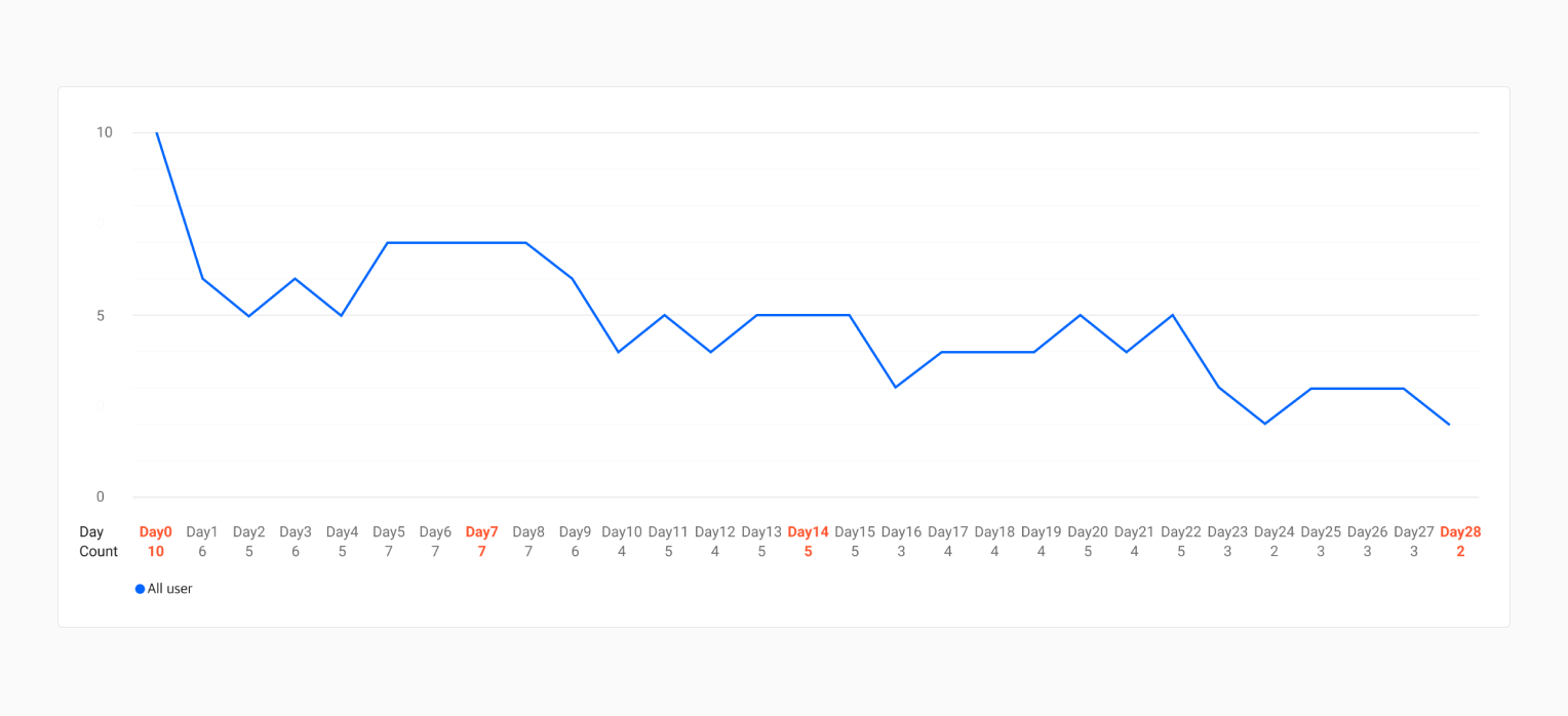
Figure 1-1
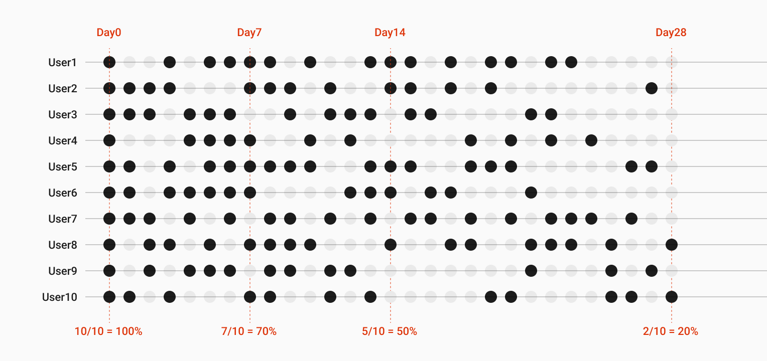
Figure 1-2
In Figure 1-1, if 10 users started using the service for the first time on the same day (Day 0), and 7 users carried out a specified behavior or event on Day 7, 7/10 = 70% would be the retention rate of Day 7. Similarly, if you want to see the retention rate within the span of 28 days, the N-day retention on Day 28 will be 20%.
Usually, as shown in Figure 1-2, the frequency of user actions gradually decreases after initial entry, and hence the shape of the graph in Figure 1-1 is a downward-sloping curve. Therefore, to understand the trend of these users, it is recommended to look at a graph form of retention rates rather than a chart form to understand how the user's behavioral cycle changes.
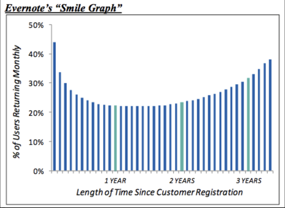
Retention Smile Curve Are you aware of Evernote's Smile Graph? As explained above, the retention curve is usually downward-sloping. However, for products that accumulate more users over time, a smile curve occurs where the percentage of returning users increases over time. This means that the value of the service has increased for users. Figuring out how long it takes for the smile curve to appear may be one way to view your retention graph and understand your product.
Supported Retention Types
Currently, Hackle provides N-day and Unbounded retention types. You can select the appropriate type depending on the service to get the desired results.
1. N-day Retention:
Measures the ratio of users who have reused within a specific day or period. This is the most basic type that comes to mind when talking about retention analysis. It is suitable for products with short and repetitive reuse cycles, such as food delivery, messengers, OTT, etc. If the measurement period is daily, it is expressed as N-day; if it is weekly, it is expressed as N-week; and if it is monthly, it is expressed as N-month.
2. Unbounded Retention:
Measures the ratio of users who have reused even after a specific day or period. It is more complex than N-day, but it is suitable for determining retention for commerce services with long repurchase cycles, or where users do not reuse regularly in a short period of time. Since the ratio of users who have reused even after a specific period is measured, 100% minus the Unbounded Retention rate is the same as the service dropout rate.
Create a new retention chart
Step 1: Select Events
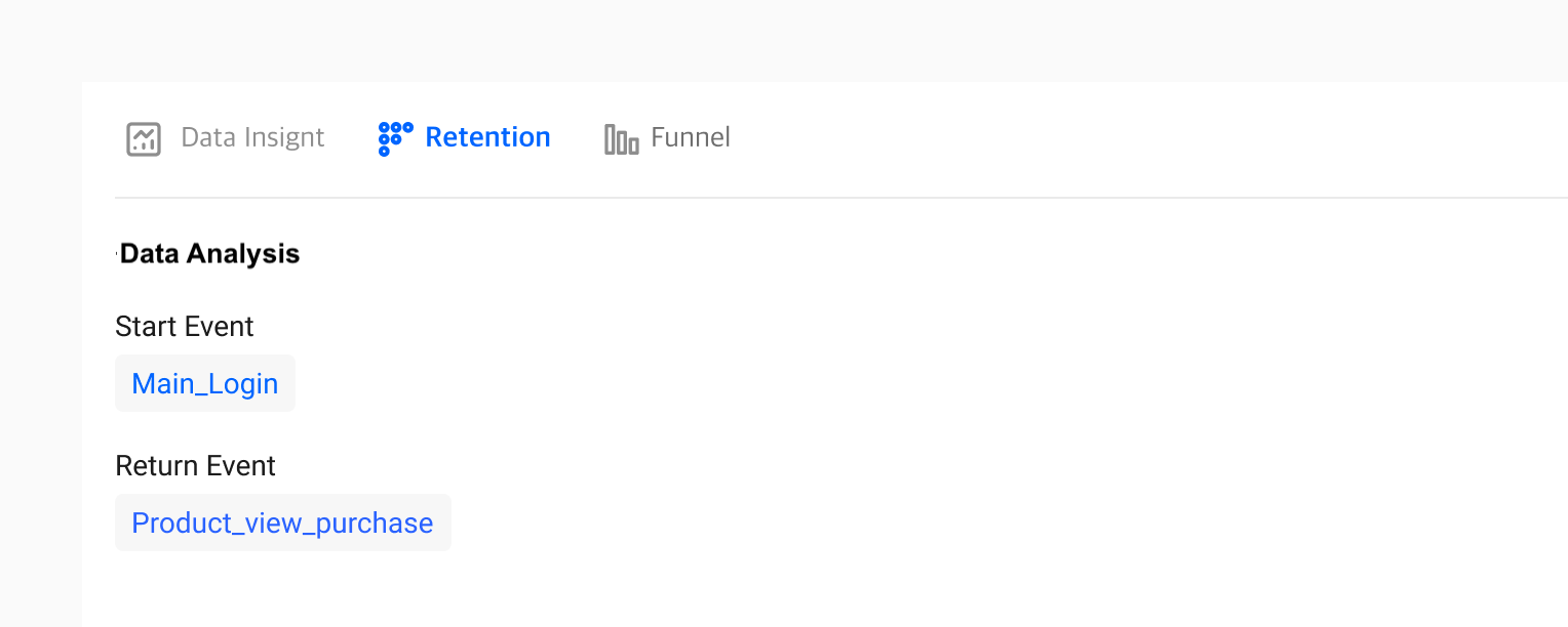
Figure 2-1
You need to select the events that go into both the Start and Return sections. The Start event is based on the first point of contact or usage, while the Return event is based on the return or recurring usage after N-days (number of days). Hence, if you select "Main_Login" as your Start event and "Product_view_purchase" as your Return event, you are setting the condition as users who came back to "purchase" your product after they "visited your homepage" during a set time period.
Step 2: Understand Charts
If you selected the events accordingly as shown in Step 1, you can visualize the retention (revisit) rate by each cohort. In Hackle's retention analysis, when both the Start event and the Return event are selected, both the graph and table chart are immediately displayed at the bottom, as shown in Figure 3-1 and Figure 3-2. After selecting your events, you can also customize the period. You can also hover over the mouse to check the actual retention percentage and the number of users for a specific time/day.
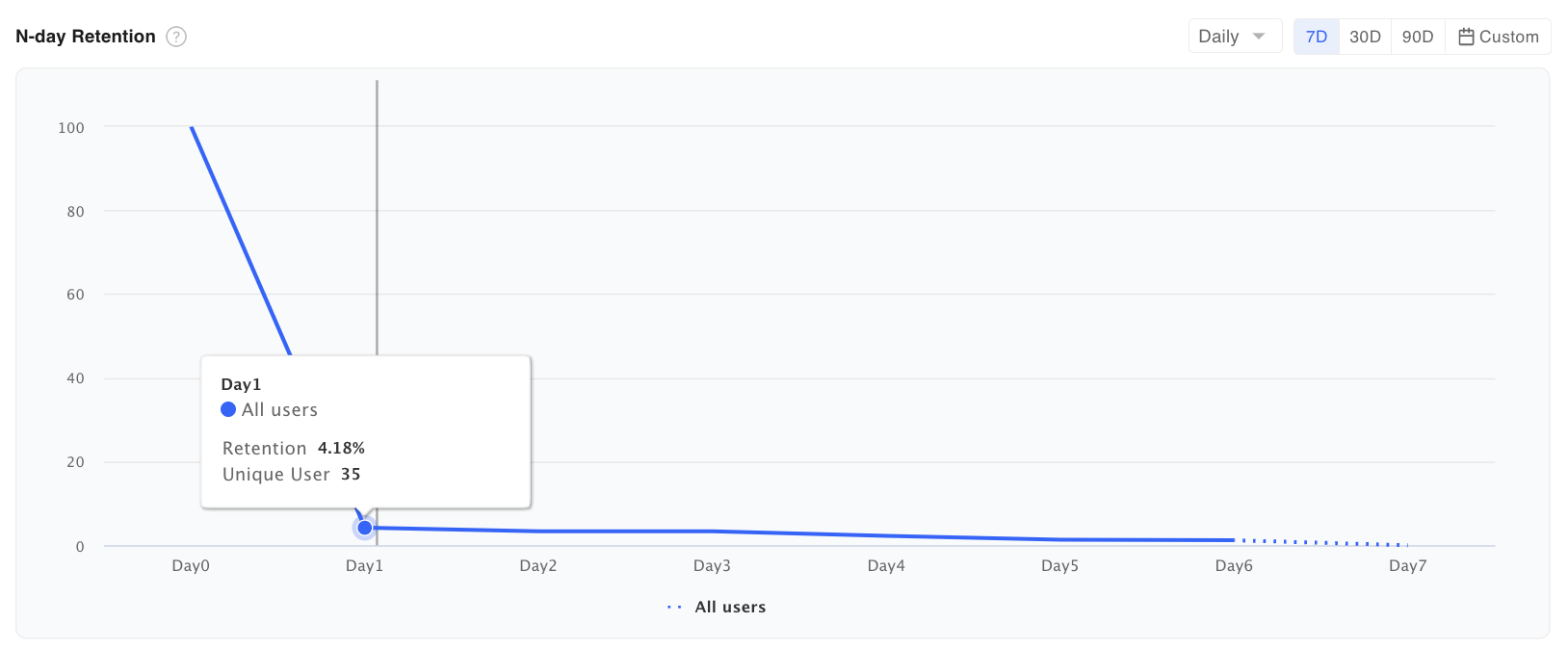
Figure 3-1 Retention Graph
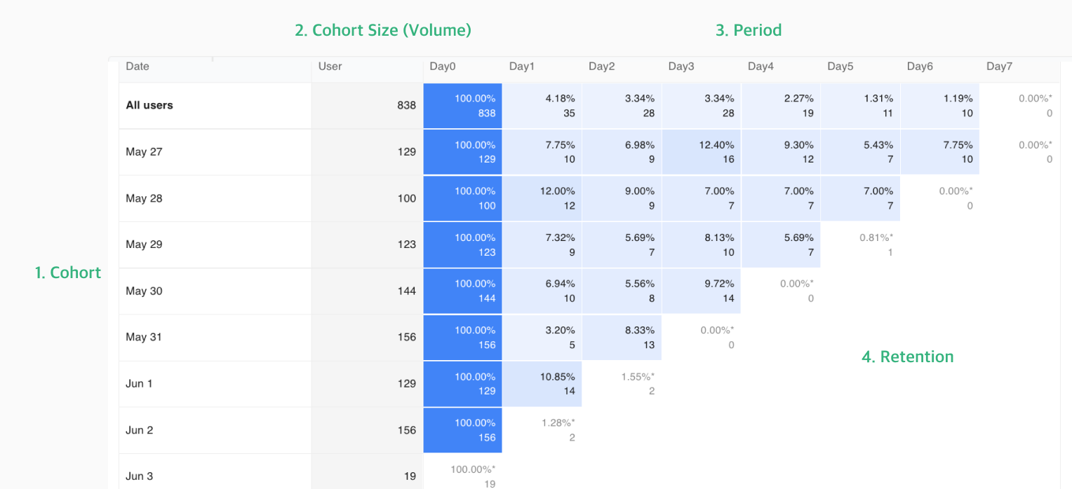
Figure 3-2 Retention Table Chart
Configuration of Hackle's Retention Table Chart As shown, the structure of Hackle's retention table chart consists of 4 elements: cohort, cohort size, period, and retention rate.
-
Cohort: A group of customers that share the same characteristics. In Hackle's Retention Analysis, this characteristic is the event initiated date or the group of people who initiated the event you specified on a particular date. This dimension will be placed on the vertical axis.
-
Cohort size (volume): The number of people in each cohort and the pool of users who initiated the "start event." For example, if you set your start event as users who logged in and the return event as visiting the product detail page, the number of logged-in users becomes the cohort size or total volume of each cohort, and the unique number of users who initiate the return event becomes the numerator for calculating the retention rate starting from Day 0 onwards.
-
Period: The time period for your cohort analysis. For example, if you select 7 days, you can see the retention data from Day 0 to Day 7.
-
Retention: You can check the aggregated retention by period by grouping a row based on the start event date. You can check the unique count and retention rate (%) based on volume. The higher the retention rate, the darker the shadows in each table.
- N-day retention: It measures the proportion of users in a cohort who reused the service within a specific period (d14, w4, m2). You can compare the retention rates for different periods within the same cohort (row) or compare the retention rates for different cohorts within the same period (column).
- Unbounded retention: It measures the proportion of users in a cohort who have reused the service at least once from a specific period up to the current date (d14 to today, w4 to today, m2 to today). It has the advantage of easily comparing churn rates among cohorts and can reveal meaningful trends even in short daily retention cycles. It is suitable for measuring cumulative effects after specific events, such as promotions or reactivation campaigns. However, even for the same period (column), the actual measurement periods may vary among cohorts, making it unsuitable for direct comparisons between cohorts within the same period.
- Calculation differences between two types of retention Retention is always measured based on UV (unique visitors) regardless of the type. It is calculated by taking the number of visitors who revisited during a certain period (e.g., on the same day (d0), one day later (d1), two days later (d2), etc.) - the numerator, out of 100 people who first visited on a specific date (1/1) as the denominator. For N-day retention, the retention rate for d1 is measured as 50%, based on 50 out of the 100 people who first visited on 1/1 and revisited on 1/2. Similarly, the retention rate for d2 is measured as 30%, based on 30 out of the 100 people who first visited on 1/1 and revisited on 1/3. Note that there may be overlap between the 50 and 30 individuals but not within each cohort. For Unbounded retention, the denominator is still fixed at 100 people who first visited on 1/1, but the numerator for d1 retention is the number of individuals who revisited on or after d1 (e.g., 1/2, 1/3, etc.). This means that the numerator for d1 retention is 60%, based on 60 (50 on 1/1 + 30 on 1/2 + 10 on 1/3 ... and removing any overlap between visitors) out of the 100 people who first visited on 1/1. As time goes on, the duration used to measure d1 retention increases, which means that the retention rate for d1 may increase over time rather than remaining fixed at 60%.
Step 3: Saving your Retention Analysis
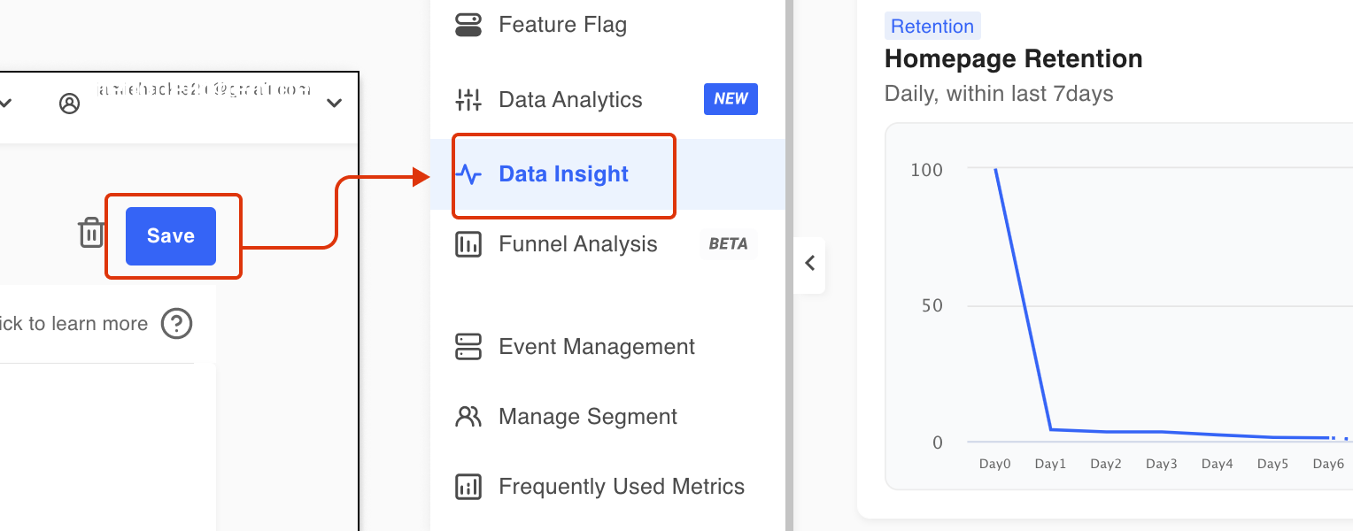
Figure 4-1
When you save a retention file, you can check the saved report in the Data Report menu on the left to monitor it continuously.
Retention Chart Use Case
1. About Acquisition
- What is the daily retention rate of users who have revisited the service in the last 7 days?
- Start event: Any Event (Any Event is the total of all events sent to Hackle, suitable for measuring 'visits')
- Return event: Any Event (Any Event is the total of all events sent to Hackle, suitable for measuring 'visits')
- Period: Daily, recent 7 days
- On average over 7 days, how many users are still active two weeks after signing up?
2. About User Behavior
- How often does a user perform a specific action (like, send a message, follow, etc.) daily?
- Start Event: Any Event
- Return Event: Favorite
- Period: Daily, recent 7 days
3. About Payment
- What is the weekly repurchase retention data of users who visited the service in the last 30 days?
- Start Event: Any Event
- Return Event: Purchase
- Period: Weekly, recent 30 days
- How different is daily retention between All users and paid users?
Retention Chart Tip
1. Handling cases where a user triggers the start event across multiple periods
- Enable the 'Unique user among segments' option: Users will be included only in the first period in which they triggered the start event. This option provides more accurate analysis results as each user is included in only one user cohort. It is recommended to use this option when the number of users per cohort is sufficient.
- Disable the 'Unique user among segments' option: Users will be included in each period in which they triggered the start event. Even when the total number of users is small, this option allows you to observe retention trends over time.
- If a user triggers the start event multiple times within a day or week, by default, they will only be counted once in the first period, regardless of the above options.
2. Define cohorts strictly based on the initial visit date throughout the entire period
- By default, Hackle defines cohorts based on the first entry point for each user within the selected analysis period (e.g., the last 30 days). If you want to define cohorts based on the initial visit date for each user throughout the entire period, similar to in-house data analysis, we recommend the following configuration:
- When sending user information via the SDK, include the attribute 'New User=True' if the user is a new user. This attribute should be updated to 'New User=False' after 24 hours of entry. Refer to the SDK > User Identifier and Attributes documentation for more details.
- Add the filter 'New User=True' to the Start Event and add the filter 'New User=False' to the Return Event.
Updated 8 months ago
