Step 8: Interpret Results
How to Check A/B Test Results
If the experiment is implemented without error, traffic is assigned and the users are exposed to the A/B test, the A/B test results are available in an hour and updated hourly from that point onwards.
Hackle collects information on events or behaviors from users exposed to each test group to calculate the pre-registered metrics and provide statistically meaningful results.
Raw data extractionWith a paid plan (Pro plan or higher), you can extract data regarding user distribution to test groups and events.
For more information about data extraction, please refer to **Frequently Asked Questions (SDK Integration).
What the A/B test results provide
They provide the A/B test results based on the metrics you registered before starting the experiment. The final results of the A/B test that can be found on the "Metrics" menu are as follows.
Common features
These are the common menu items found on the Dashboard regardless of the metrics or settings of your A/B test.

The total number of exposed users can be checked after the end of the experiment.
- Total Exposures: The total number of exposed (unique) users to the experiment. This number, along with the data collected for each metric, is updated every hour after the experiment begins.

Data Summary is provided where users can check the improvement rate compared to group A. If the results show statistical significance, the data will be either green or red.
Hackle allows users to check the results of the A/B test with two statistical analysis methods, Frequentist p-value, and Bayesian. You can select the statistical analysis method you desire.

If you select the Frequentistic p-value statistical analysis approach, you can check the A/B test results in the following format on the Hackle dashboard.

If you select the Bayesian statistical analysis approach, you can check the A/B test results in the following format on the Hackle dashboard.

Bayesian Results
These are the categories you can find from the Metrics menu.
- Total Users: The number of users exposed or allocated to each test group.
- Improvement Rate from Test Group A: It means the difference in the metric value measured in each experimental test group (group B, group C, ...) compared to control test group A. It indicates the relative rate of change, and the value in parentheses means the absolute difference between the target value.
- -: means the value of the metric results of the control test group A.
- P-value: Describes how statistically significant the improvement is over test group A's data. The p-value can represent a value from 0 to 1, and generally, if it is less than 0.05, it can be considered statistically significant.
- Confidence interval: You can check the range of values that the actual 'improvement rate compared to test group A' can represent. If the test result is significant, the confidence interval will contain only positive numbers or only negative numbers.
The following workspace menu items that show the results of the experiment will depend on the type of metrics set.
'Conversion Rate' Metric
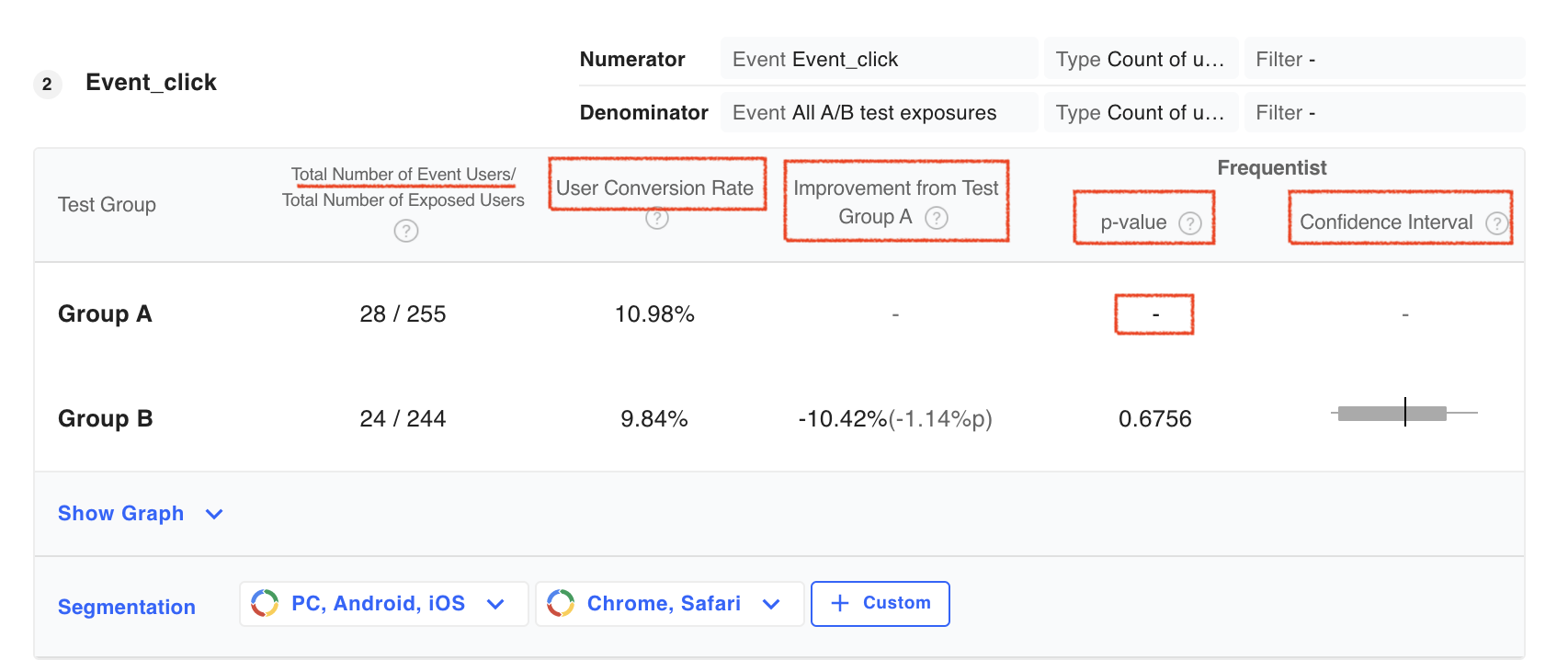
Items in the first two columns of the metrics table may be displayed with different labels depending on the event of the denominator selected when registering the metric and the calculation type of the denominator/numerator.
You can see some of the common metric types below.
-
Total Number of Unique Users: Number of unique users who triggered event specified in the numerator
-
User Conversion Rate: Number of
Total Number of Unique Usersdivided byTotal Number of Exposed Usersin each test group shown as a percentage.
'Average Value per User' Metric
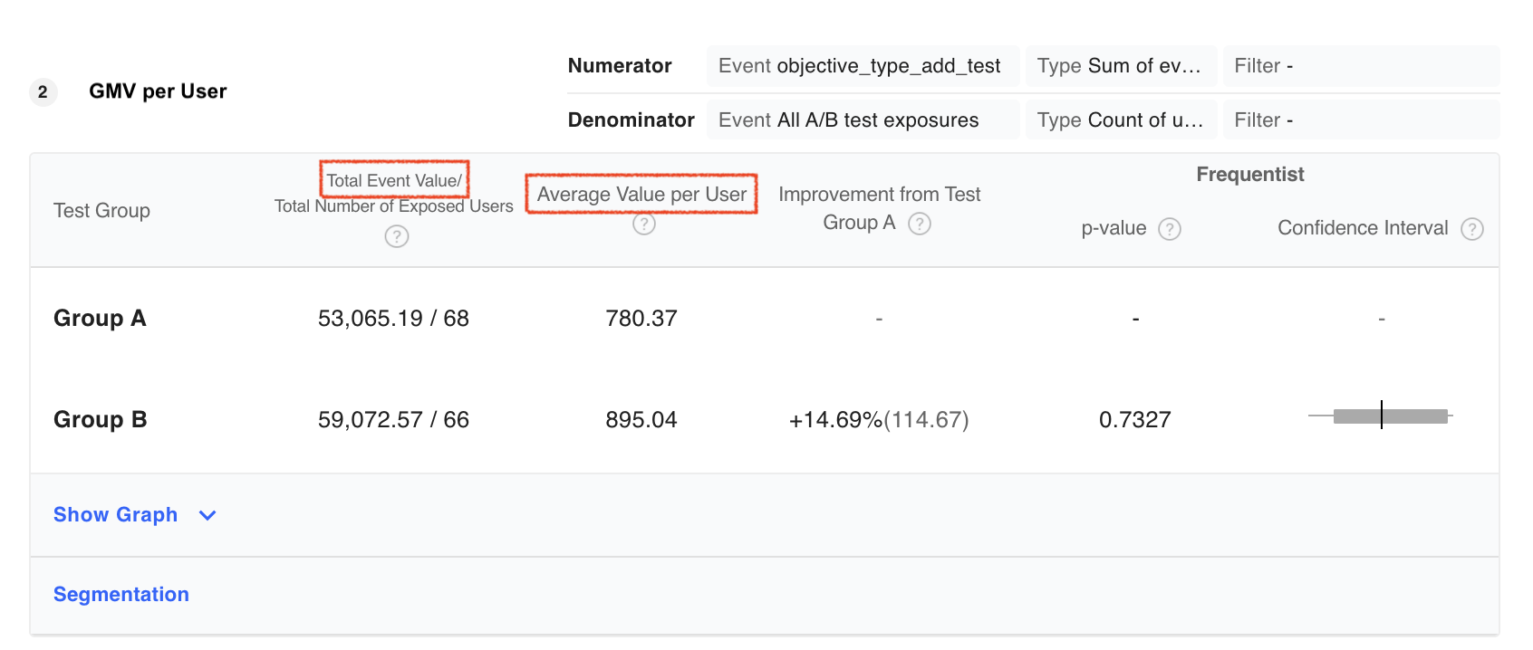
- Total Event Value: For the events generated by users exposed to each test group, it means the sum of all values provided as properties of the events. For example, a property of an event called
Purchase completedcan providePurchase Amount, in which caseTotal Event Value** will be the total purchase amount of users. - Average Value per User:
Total Event Valuedivided byTotal Number of Exposed Users. If you use the example ofpurchase amount, it means the average purchase price of users exposed to each test group.
'Average Count per User' Metric
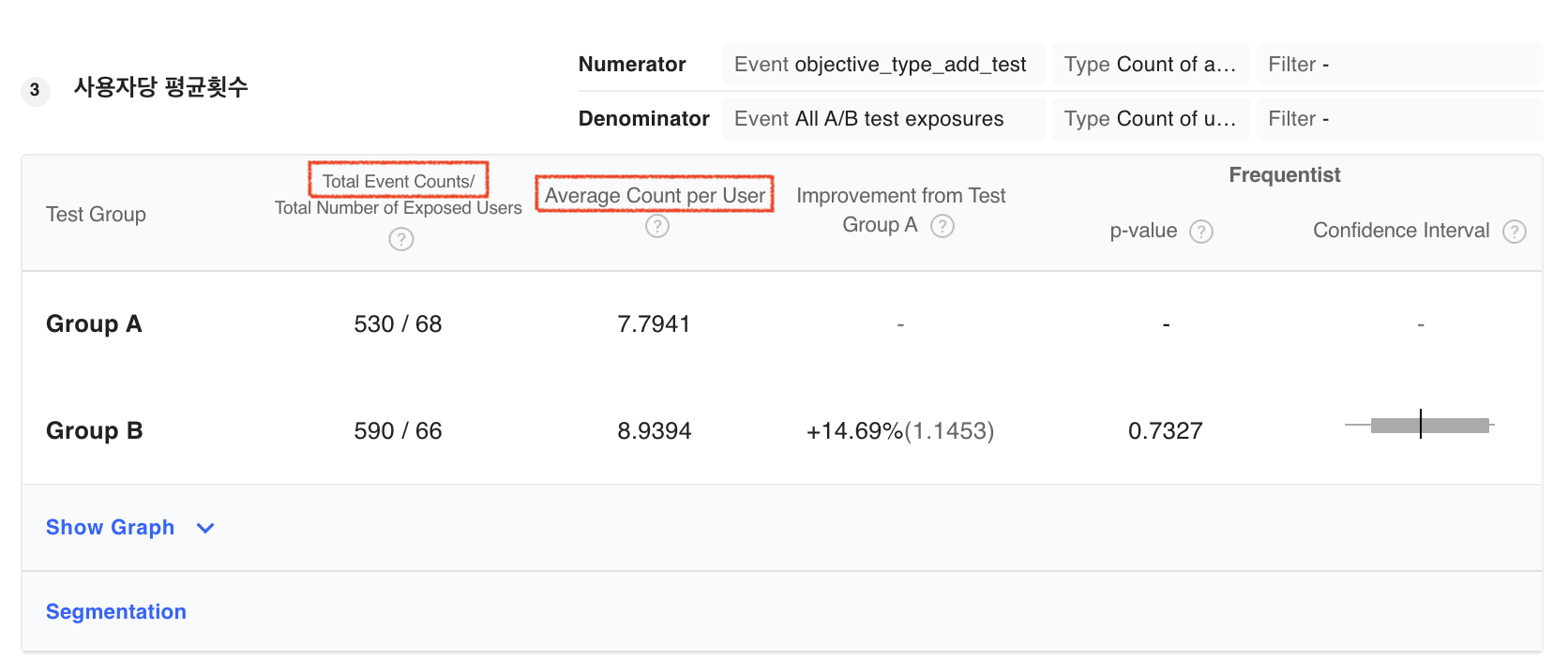
-
Total Event Counts: The sum of all events that were triggered by users exposed to each test group . For example, if you set the event as the
Like button, then the total event counts will be the sum of the number of times users clicked theLike button** . -
Average Count per User:
Total Event Countsdivided byTotal Number of Exposed Users. If we go back to our example of theLike Button, it means the average number of times that users exposed to each test group clickedLike Button.
Items with Statistical Significance
These are the items that indicate the statistical meaning that can be checked for each metric set.
Confidence Interval
On the Hackle Dashboard, you will be able to see the range of values that represents Improvement compared to group A`. If the test result is statistically significant, the confidence interval will contain only positive numbers or only negative numbers. You can view the numerical values at both ends of the confidence interval by hoving your mouse cursor over the confidence interval.
If the result is significant and positive, the confidence interval is to the right of zero.
In this case, a green Significant badge is placed to the right of the corresponding test group name. This means that the test group performed significantly better than group A.

If the result is significant and positive
If the result is significant and negative, the confidence interval is to the left of zero.
In this case, a red Significant badge is placed to the right of the corresponding test group name. This means that the test group underperformed significantly compared to group A.

If the result is significant and negative
If the result is not statistically significant and does not lead to a conclusion, the confidence interval will contain 0% as a part of its range.
In the example below none of the test groups are badged Significant because none of the test groups performed meaningfully.

If it is not possible to draw conclusions
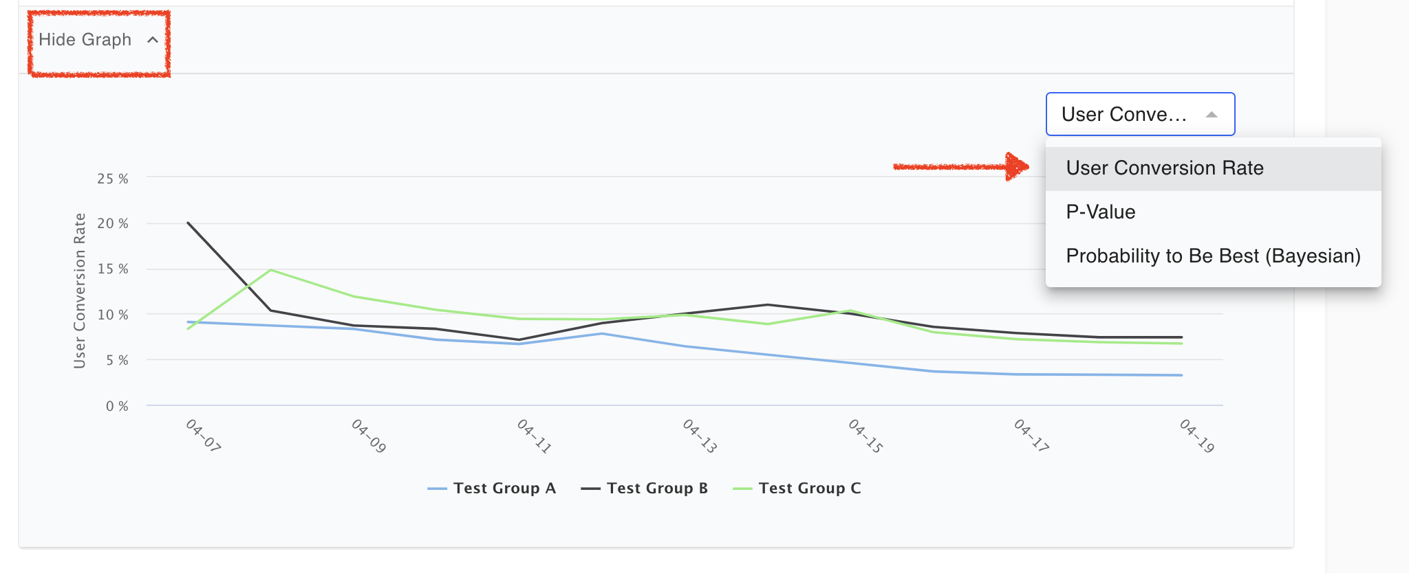
Trend graph
Click the View Graph at the bottom of each target to see a graph showing the trend by date. (When the graph is displayed, the text changes to Hide graph.)
You can choose from three items: the selected metric type, P-Value, and Best Probability (Bayesian). The image below is when user conversion rate is selected as the target.
-
P-Value: A value expressing the reliability of the A/B test result. A lower p-value means a more reliable result.
In particular, if it is less than 0.05, it can be judged to show statistical significance. In this case, you can see the 'Significant' badge. -
Probability of Best: Indicates the probability that each test group is best. These values are calculated based on ps://en.wikipedia.org (https://en.wikipedia.org/wiki/Bayesian_statistics).
-Probability to Beat Test Group A: Indicates the probability that the test group is superior to the control group (test group A). The values are also calculated based on Bayesian statistics.

Hovering the mouse cursor over the graph line shows the number for that section.
If you want to know the numerical value of a specific point on the graph, you can check it by hovering the mouse over the point as shown in the image above.
Updated 20 days ago